The financial market offers a very wide variety of approaches, strategies, tools, etc. There are 4 different types of charts at IQ Option and here we will explain the details of each one, as well as their strengths and weaknesses.
Charts are a fundamental part of trading, because it is through them that you can take readings, analyze and make projections about the price of a particular asset. Due to the large number of different approaches and studies, there is more than one type of chart available for trading the most varied markets and financial assets.
We think it’s important that you know what each one is for and understand what types of strategies and techniques are applicable to each one. That’s why we’re dedicating this article to explaining each of IQ Option‘s charts.
The first thing you should know is that for all chart types the price will be on the vertical line and the chart time on the horizontal. At IQ Option, there are 4 different charts available for you to try out. It’s important to note that on each of them you can also adjust the time scale.
What is the best chart to trade on IQ Option?
Before we start, you might be wondering if there is any type of chart that is better. We’ll answer that right away: it depends on your trading style and your goals, so we recommend reading this article to the end and testing each of IQ Option‘s charts on the demo account.
How to understand the candlestick chart?
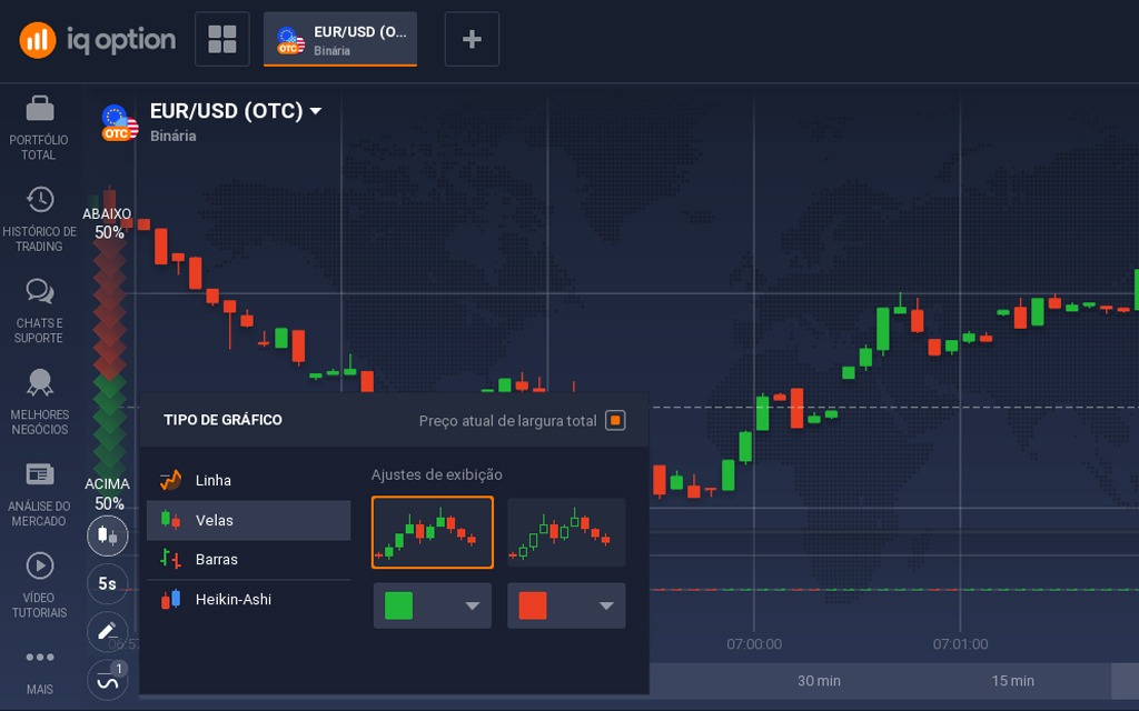
The IQ Option candlestick chart is the most common and popular among traders because of the wealth of information it provides.
The first thing you need to understand is that each candle represents the movement of the price within a time interval, i.e. if in the selected chart time even if the price has risen but closed below the previous value, the candle will be represented by a red bar representing the fall.
However, during the movement, you can see the behavior of the candle until the close and understand the oscillation of the asset’s price within the selected IQ Option timeframe.
Candlesticks are made up of: opening price, closing price, as well as their oscillations. The body of the candlestick (or candle) is the path the price took between opening and closing.
Why trade using IQ Option candlestick charts?

The main reason for this is the amount of information it displays without polluting the screen. If the closing price is higher than the opening price, the candle will be bullish and green, otherwise it will be bearish and red.
The downside of this IQ Option chart is that you can see the price oscillation within the candle, but you don’t get any information about its movement.
Line graph
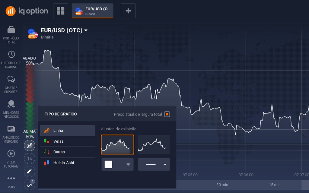
The linear chart is the simplest to understand because, as the name suggests, it consists of just one line, which oscillates according to price changes. For visualization and understanding, it is certainly the best option, especially for beginners.
However, compared to the other chart types on IQ Option, the simplicity ends up omitting important information that you can observe, for example, on the candlestick chart, such as trends.
Why trade using line charts on IQ Option?
As we said above, we recommend this chart if you are new to the market. Its simplicity will help you familiarize yourself with the platform, indicators, tools, etc.
However, as you learn, you may end up being limited by its simplicity and opt for another type of chart on IQ Option.
Bar chart
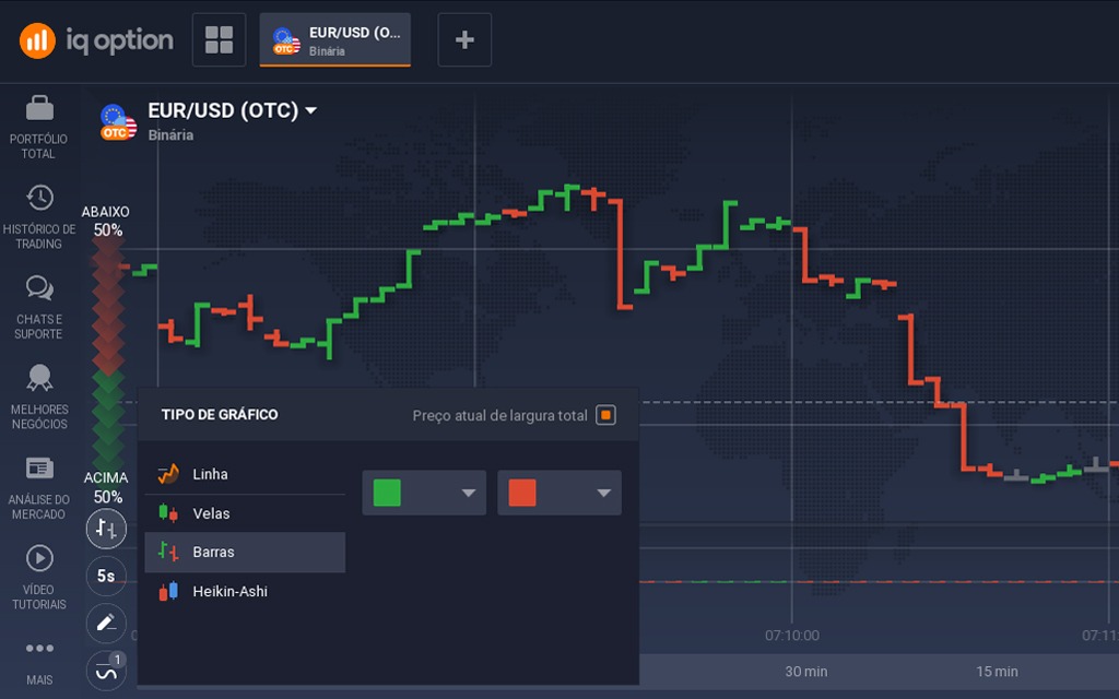
The bar chart was one of the first types used in the market, and the first studies on technical (graphical) analysis were based on this type of approach.
Bars work in a similar way to candles, with the length of the line representing the asset’s volatility (high and low). On the left, the bars have a small dash, which indicates the price at the opening of the period.
On the right, there is another horizontal line, representing the closing price.
This type of chart on IQ Option is good for reading the strength of movements according to the opening and closing of the bars.
Why trade using bar charts on IQ Option?
The bar chart is similar to the candlestick chart and provides a good reading of the range and volatility of the market. However, you can’t follow the price movement on this type of chart, so you need to select shorter time periods.
Heikin-Aishi chart
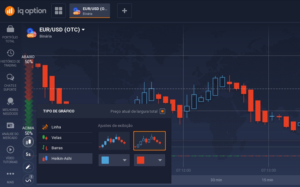
This differently named chart comes from the Japanese language, where Heikin means middle or balance, and Aishi means leg, or price bar. In fact, this chart has Japanese origins and its purpose is to eliminate the irregularities of the candlestick, which occurs in the candlestick chart.
As we mentioned in the IQ Option candlestick chart, the candlesticks are represented by the colors green if the price closes above the opening value, and red if it closes below.
Visually, this can be rather difficult to analyze, especially over long periods, as there will often be a large alternation between the green and red colors, making it difficult to see trends.
The way this chart is made allows trends and reversals to be easily visualized.
Why trade using Heikin-Aishi charts on IQ Option?
As the purpose of this chart is to indicate trends, it is excellent for trades with longer expiration dates, remembering that trading in favor of the trend is something that every trader should do.
Its disadvantage is precisely for shorter periods, because as its focus is on trends, if you want to make trades from 1 to 5 minutes, this chart on IQ Option may not be the best alternative.
After reading this article, you can get used to the chart types with a demo account on the IQ Option platform, and get to know the most interesting trading strategies.